“Simple can be harder than complex: you have to work hard to get your thinking clean to make it simple. But it’s worth it in the end because once you get there, you can move mountains.”
Steve Jobs

Minimalism in graphic design is all about simplicity. Its aim is to reduce the amount of information in a piece of artwork or design. The idea is to reduce the number of visual elements in a project, and use only those needed to effectively communicate its purpose.
It’s very easy to get caught up in the details. The font is too small, or the margins are too tight. There isn’t enough contrast between the text and the background. But in a world of clutter, these details become extra noise instead of carefully crafted elements that add meaning and purpose to your design.
As a result, the best design is often the most simple. Clean and uncluttered designs can be much more efficient than their counterparts.
Here are some points to ponder.
Simplicity is key.
Resist the urge to over-complicate and decorate. Take away rather than add. It’s not just about the visuals either; good design encompasses functionality, ease of use, and accessibility as well. It’s worth saying that good design should never get in the way of any of these components. The best designers work hard to make their designs feel effortless like they were meant to be.
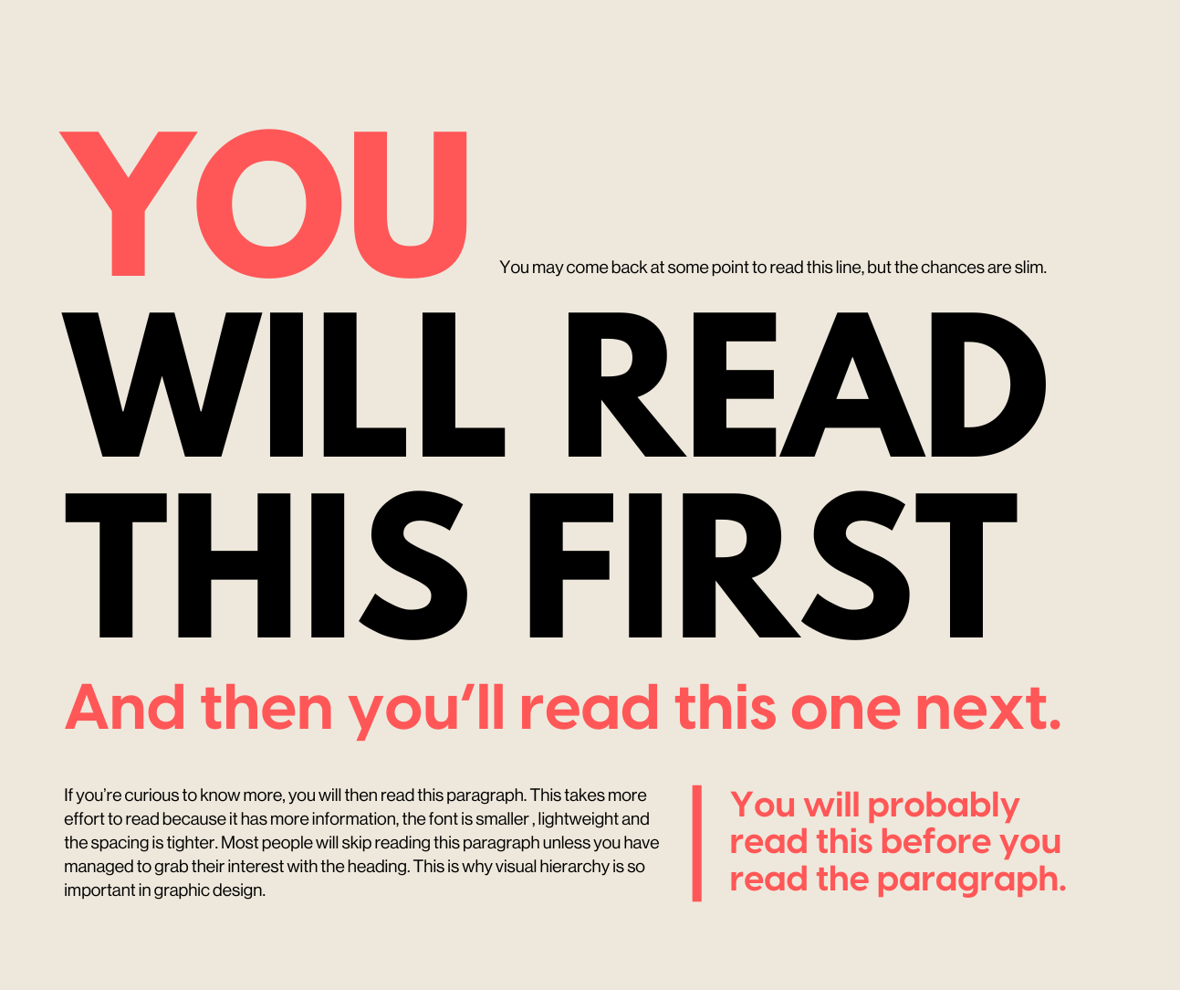
Choose your Typography carefully.
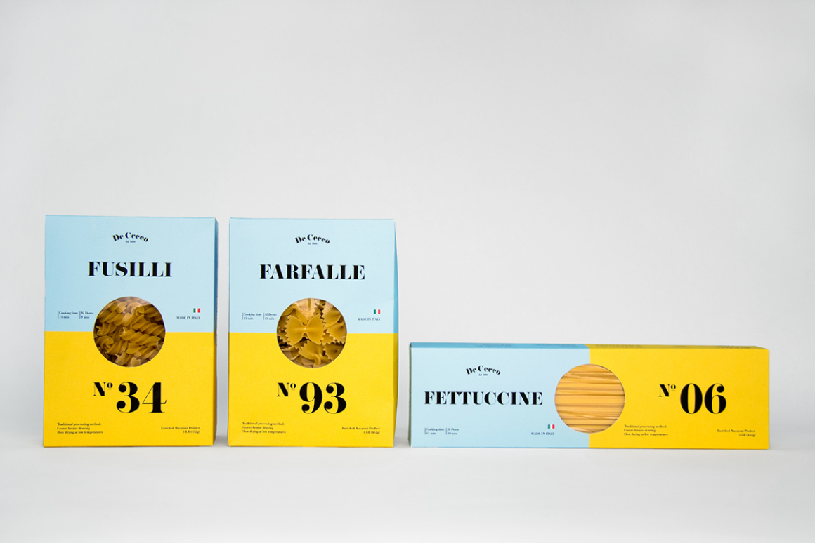
Keep to around 2 fonts and use different weights to indicate hierarchy. The font should be clean, easily readable, and…you guessed it, simple.

Streamline your colour palette.
Aside from your base colours, black and white, choose one other colour which will deliver the punch.
Remove the excess fat.
Consider each element in the design, what is its functionality? If it is not vital to get the message across, then remove it.
Breath, it’s just White Space!
White space is an essential part of graphic design, and it can make or break a design. It’s an often-overlooked element that helps the viewer’s eye move through each element in your design. White space is also known as negative space, even though it isn’t truly “negative”.

Create balance to achieve harmony.
If using heavy text, make sure to counterbalance it with white space or colour.
By designing with these concepts in mind, we can create a minimalistic design that will bring your project to the next level. I hope these tips have been helpful for you and I’d love to hear from you about your own minimalist design needs!